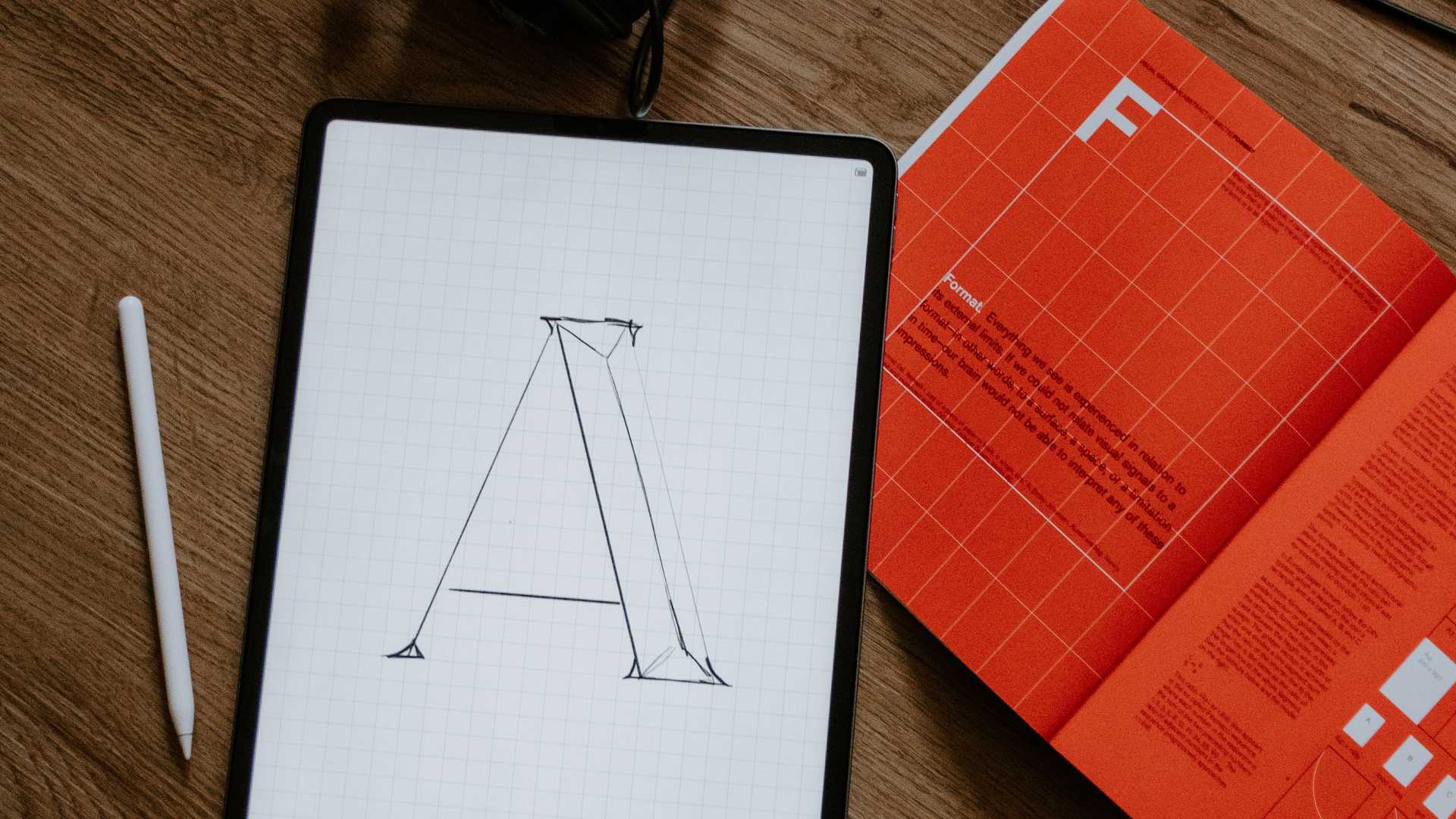
An Essay on Typography by Eric Gill takes the reader back to the year 1930. The year when a conflict between two worlds came to its term. The machines of the industrial world finally took over the handicrafts.
Humane Typography in the Digital Age

The typography of this industrial age was no longer handcrafted. Mass production and profit became more important. Quantity mattered more than the quality. The books and printed works in general lost a part of its humanity. The typefaces were not produced by craftsmen anymore. It was the machines printing and tying the books together now. The craftsmen had to let go of their craft and became a cog in the process. An extension of the industrial machine.
But the victory of the industrialism didn’t mean that the craftsmen were completely extinct. The two worlds continued to coexist independently. Each recognising the good in the other — the power of industrialism and the humanity of craftsmanship. This was the second transition that would strip typography of a part of its humanity. We have to go 500 years back in time to meet the first one.
The first transition
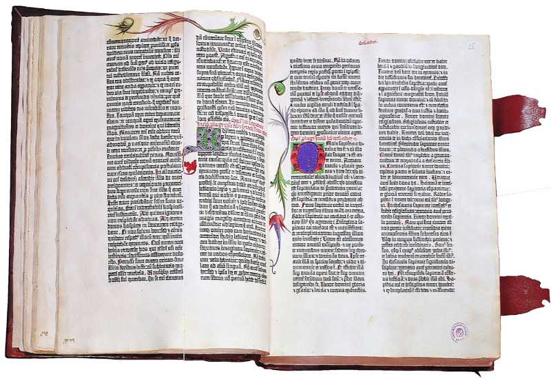
A similar conflict emerged after the invention of the first printing press in Europe. Johannes Gutenberg invented movable type and used it to produce different compositions. His workshop could print up to 240 impressions per hour. Until then, the books were being copied by hand. All the books were handwritten and decorated with hand drawn ornaments and figures. A process of copying a book was long but each book, even a copy, was a work of art.
The first printed books were, at first, perceived as inferior to the handwritten ones. They were smaller and cheaper to produce. Movable type provided the printers with flexibility that allowed them to print books in languages other than Latin. Gill describes the transition to industrialism as something that people needed and wanted. Something similar happened after the first printed books emerged. People wanted books in a language they understood and they wanted books they could take with them. They were hungry for knowledge and printed books satisfied this hunger.

The 42–Line Bible, printed by Gutenberg.
But, through this transition, the book lost a large part of its humanity. The machine took over most of the process but craftsmanship was still a part of it. The typefaces were cut manually by the first punch cutters. The paper was made by hand. The illustrations and ornaments were still being hand drawn. These were the remains of the craftsmanship that went almost extinct in the times of Eric Gill.
The digital age
The first transition took away a large part of humanity from written communication. Industrialisation, the second transition described by Eric Gill, took away most of what was left. But it’s the third transition that stripped it naked. Typefaces are faceless these days. They’re just fonts on our computers. Hardly anyone knows their stories. Hardly anyone cares. Flicking through thousands of typefaces and finding the “right one” is a matter of minutes.
In the new computer age the proliferation of typefaces and type manipulations represents a new level of visual pollution threatening our culture. Out of thousands of typefaces, all we need are a few basic ones, and trash the rest.
— Massimo Vignelli
Typography is not about typefaces. It’s not about what looks best, it’s about what feels right. What communicates the message best. Typography, in its essence, is about the message. “Typographical design should perform optically what the speaker creates through voice and gesture of his thoughts.”, as El Lissitzky, a famous Russian typographer, put it.
Loss of humanity through transitions
Each transition took away a part of humanity from written language. Handwritten books being the most humane form and the digital typefaces being the least. Overuse of Helvetica is a good example. Messages are being told in a typeface just because it’s a safe option. It’s always there. Everyone knows it but yet, nobody knows it. Stop someone on the street and ask him what Helvetica is? Ask a designer the same question. Ask him where it came from, when, why and who designed it. Most of them will fail to answer these questions. Most of them used it in their precious projects but they still don’t spot it in the street.
Knowledge of the quality of a typeface is of the greatest importance for the functional, aesthetic and psychological effect.
Typefaces don’t look handmade these days. And that’s all right. They don’t have to. Industrialism took that away from them and we’re fine with it. We’ve traded that part of humanity for a process that produces more books that are easier to read. That can’t be bad. And it isn’t.
Humane typography will often be comparatively rough and even uncouth; but while a certain uncouthness does not seriously matter in humane works, uncouthness has no excuse whatever in the productions of the machine.
— Eric Gill
We’ve come close to “perfection” in the last five centuries. The letters are crisp and without rough edges. We print our compositions with high–precision printers on a high quality, machine made paper.

Type through 5 centuries.
We lost a part of ourselves because of this chase after perfection. We forgot about the craftsmanship along the way. And the worst part is that we don’t care. The transition to the digital age made that clear. We choose typefaces like clueless zombies. There’s no meaning in our work. Type sizes, leading, margins… It’s all just a few clicks or lines of code. The message isn’t important anymore. There’s no more “why” behind the “what”.
Chasing perfection
Human beings aren’t perfect. Perfection is something that will always elude us. There will always be a small part of humanity in everything we do. No matter how small that part, we should make sure that it transcends the limits of the medium. We have to think about the message first. What typeface should we use and why? Does the typeface match the message and what we want to communicate with it? What will be the leading and why? Will there be more typefaces in our design? On what ground will they be combined? What makes our design unique and why? This is the part of humanity that is left in typography. It might be the last part. Are we really going to give it up?
Originally published by Matej Latin on Medium.